
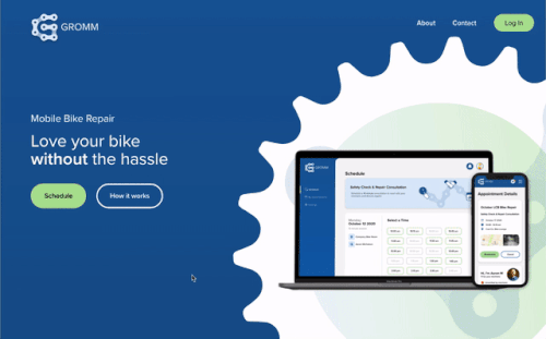
Gromm™
Overview
Left Coast Bicycles (LCB) is a mobile bike repair company. They provide service for bike commuters at their offices over one week. LCB currently has clients schedule, get reminders, and pay using three different apps. The owner wishes there was a way to streamline his scheduling process to reduce manual input and reduce no-shows. We created Gromm, an app that combines scheduling, reminders, and payment all in one app through the design process.
The Problem
LCB currently uses Google Sheets to schedule events in real-time, Gmail to send reminders (manually with templates), and square for payment processing. While there are many scheduling platforms available, none offers real-time scheduling for discrete events, which LCB needs. This current system requires a lot of manual input, and the lack of automation results in a lot of no shows.
We want to figure out how we might create a more streamlined process to schedule repairs for discrete events and reduce no shows.
Users & Audience
This platform is for bike commuters who's offices provide mobile bike repair benefits.
Roles
I was the User Experience Designer. I conducted user research, created the personas, user flows, wireframes, prototypes, and final user testing. I also collaborated with senior designers for feedback along the way. I used Figma, Illustrator, and Adobe, XD.
Scope & Constraints
The project's scope is to create a working prototype of a client-facing bike repair scheduling platform. Due to time constraints, I will design the mechanic side another time.
The Solution
The solution is a bike repair scheduling platform called Gromm. Clients can schedule, receive reminders and alerts, and pay all in one place.
The current prototype is the client-facing part of the platform. Users can schedule a 15-minute consultation with the onsite mechanic, see their upcoming and past appointments, receive reminders before their meeting, and a reminder and final summary when their bike is complete. These features will provide better communication to the client and a more streamlined system for the mechanic to reduce no shows.

Discovery & Research
I began digging into the mobile bike industry to see how their scheduling worked and what processes they used. I completed a competitive analysis comparing Velofix, another mobile bike repair company, Beeline, a scheduling and inventory platform for bike shops, and a popular scheduling platform, Simplybook.me.
I also sent out a user survey to LCB's clients to find the system's most significant pain points. I found that most users wanted a confirmation after scheduling and a better way to reschedule.
From the competitive analysis and user survey, I created two personas, Brenda and Grant.

After comparing Velofix, Beeline and Simplybook.me the biggest takeaways were:
Velofix uses Vonigo, a third party service management api to schedule and manage their mobile bike repair fleet. Through the Velofix platform, you can schedule, get reminders, and pay. While everything is in one place there isn't a mobile platform, the layout is busy and discrete events can't be scheduled.
Beeline is a unique company that offers a scheduling platform for the bike industry. Their software allows users and mechanics to schedule repairs, and organize inventory all in one place. They do offer scheduling for discrete events however it's for a time range vs specific intervals. Beeline also doesn't have a mobile platform.
SimplyBook.me is a popular scheduling platform that is easy to navigate, it updates in real time and sends notifications. Like the other scheduling apps they also don't support scheduling for discrete events.
Out of 19 participants, I found that some users desired more communication and integrated features, while most users like real-time scheduling. Some communication features included a confirmation email and a way to add an event to their calendar after scheduling. Users also desired to pay in the platform.
I was surprised to find that more people wanted a straightforward way to reschedule and a summary alert once their bike repair was complete compared to getting event reminders.
After getting a better idea of the current user's goals, frustrations, and motivations, I created two personas.
The first is a busy working professional who is always looking for ways to optimize her day.

The second is a mechanic at a local mobile bike repair company with a hectic day. He needs to complete 20+ bike consultations with clients and prepare for his week to complete the necessary repairs.

Define
With a better idea of the user's needs and the client's business objectives, I used user stories, and user flows to identify four high priorities and three medium priorities features to help me find the best solution.
I conceptualized these priorities into wireframes and presented them to the owner and my team for feedback.
I found four high priority and three medium priority stories for the user after analyzing the user survey and personas.
I broke the user flows up into three different parts. The second and third flows get a little more complicated as they depend on the mechanic's input. To keep everything in scope, I included additional details on each flow to show where the mechanic is involved and the user stories it helps answer.
The first flow is for scheduling an appointment, which is more straightforward; the client completes all steps. This flow has solutions for all four high priority user stories.

The second is for after the appointment is scheduled, specifically right before and after the client's appointment. This flow answers one high and one medium priority user story.

Finally the third is after the mechanic has completed the repairs. This flow covers two of the medium priority user stories.

From sketches to digital wireframes, the app required a few small iterations.
I had initially misunderstood LCB's business model and had laid it out similar to Velofix, which offers various services at many different times.
I updated the digital wireframes to reflect LCB's schedule system, which includes one or two specific dates and a set of times at 15-minute intervals.

Another small adjustment included updating the app header. I couldn't decide if I wanted to design a mobile app or in mobile-first web format.
I initially decided on an app layout; however, after testing, I found it easier to integrate this platform as part of LCB's website. Iterations from app to web can be found in the iteration section of this case study.

Visual Design
I had initially planned to redesign Left Coast Bicycles logo and stick with the same color palette. Due to time limitations, we decided to focus on the scheduling platform as its own thing and revisit the rebrand at another time.
Creating a whole new brand and color palette did allow us to explore other options for LCB indirectly.
The owner and I brainstormed a list of words related to bikes, mobility, and repair. We landed on Gromm, which in the bike industry is a young inspired biker who hangs out around bike shops. The name was shorter, and it wasn't taken in the app store or as a website.
For the logo, I wanted to incorporate a bike part. My initial drawings had both a bike part and some representation of a tool. After a few iterations and playing around with a real bike chain, I created a "G" out of the chain.

While exploring rebrand options, the owner of LCB had expressed interest in blues and greens as an alternate color to his current colors, orange and gray. After some bike industry research, I found that orange and gray were commonly used. The blues and greens also provided a more playful look and went well with Gromm.
The colors also had high contrast when used together for users who experience color blindness.
For the typography, I initially chose Stozel. After adding it to the low-fi prototype, I found it didn't fit with the app's look while it was a nice clean font. I ended up going with Proxima Nova, a websafe font that's simple and doesn't draw attention to itself.
I also followed apple's accessibility guidelines when choosing the font size and weight.
Bicycle Blue
#1C5D99
Handlebar Green
#B0E298
Warning Yellow
#F1D302
Error Red
#E55934
Header 1 is 32px Proxima Nova Semibold
Header 2 is 24px Proxima Nova Semibold
Header 3 is 18px Proxima Nova Medium
Body is 16px Proxima Nova Regular
Caption is 14px Proxima Nova Regular
Prototyping & Testing
Once I finalized my style guide, I started adding color and type to the wireframes. The design went through a couple of iterations after getting feedback from LCB's owner and completing a preference test.
After the usability test and feedback received, we realized the platform would function better as part of LCB's website. The most recent iterations are a responsive web version.

After initial feedback, I created a clickable Hi-fi prototype and tested four users in person and over Zoom.
94.3%
Success rate
I asked users to complete the following Tasks:
- Walkthrough the onboarding process
- Schedule a Safety check & repair consultation
- Find the details for their upcoming appointment
- Find their final repair summary and pay for their repairs
My biggest takeaways were:
- Two users found the onboarding skip button confusing and suggested a “Continue Without Account” option.
- Everyone thought the scheduling was simple. One user suggested numbering each section to show it was steps instead of options.
- One user suggested adding bike details and notes to the appointment summary to look back at what they told the mechanic.
- Three of the four users clicked around before seeing the upcoming/past segmented tabs to find their summary and upcoming details
- Two users suggested incorporating the Gromm logo or link shape throughout the app.
After testing and receiving additional feedback from users, designers, and the LCB owner, I revised my designs to be more coherent and simple.
I removed the skip button from the upper right corner, rearranged the “Sign-Up” and “Create Account” buttons, and added a continue without account option. I also made the onboarding a carousel and added the Gromm mascot to walk everyone through.

I added the Gromm link to the app's background and changed the background to blue with white scheduling blocks. I also added numbers to the Scheduling screen to clarify that each section was a step.

I added a segmented tab to the Appointment Details screen with the bike type and any notes the user added during scheduling.

Finally, I added a link to the consultation summary to the new event summary and made the past events look different from upcoming events.
For the first iteration, I wanted to add a bike part to the scheduling screen's background. I mocked up a couple of different versions with a cog and sent out a preference test using UsabilityHub. The results ended up being pretty even, with option 'B' more preferred. Testers liked the white space and thought it was easier to read.

After the usability test, I updated the scheduling screen to incorporate the link instead of the cog. I updated the appointment details screen to have bike notes added by the client, and I updated the onboarding walkthrough with a Gromm character I created.

I went over v2 of Gromm with the owner, and we decided that it would be easier to implement the scheduling platform as part of his website.
I reorganized all of the input and feedback from the first two versions to create a responsive web platform. I redesigned the scheduling screen as a single section that populated the details as you walked through the scheduling process. The appointment details screen became a dashboard that grouped the client's consultation and repair appointments. I also added a notifications icon at the top to remind users of upcoming appointments, updates to their appointment, and when their bike is complete.
After testing the web platform, users like navigating Gromm as a web platform more. They also liked having the consultation and repair as one event, so all repair details are in one place.

With a more streamlined process and better communication through reminders and rescheduling options, Gromm would remove manual input and help reduce no-shows.
Conclusion
Growth and Outcomes
Starting this project, I had to make sure my goals were very clear. The current prototype is just the client-facing part of the app; the mechanic side will come later. I knew it would be easy to get out of scope.
After building the platform, I realized that while the app could work, I think it would be better integrated into LCB's website. The most recent iterations reflect those changes.
Going forward I want to go through the design process again for the Mechanic side and start working with the owner to get this platform in the wild.