
greener™
Overview
Studies have shown that people don’t incorporate sustainable practices into their lives because they don’t have enough information. Through a 3-week design sprint, I designed an app that gamifies sustainability, called greener. This app will provide users with a fun way to learn responsible habits.
The Problem
Sustainable behaviors are overlooked due to people not having the time and energy to figure out how. This shift in behavior also requires the introduction of mundane tasks that lack immediacy for the user.
Through designing Greener, I wanted to figure out how might we encourage users to learn more about sustainability in a fun and engaging way?
Users & Audience
This app is for users who are interested in learning more about sustainability. It is suited for those who have never implemented sustainable practices to those who have but want an engaging reminder to keep it up.
Roles
I was the User Experience Designer. I conducted user research, created the personas, user flows, wireframes, prototypes, and final user testing. I also collaborated with my mentor Becky for assistance along the way. She provided me with feedback from the Discover to the Deliver phases. I used Figma, Illustrator, InVision, and Adobe XD.
Scope & Constraints
The scope of the project is to create an app that uses gamification features to gamify sustainability. The end goal is a simplified version of the game. Greener was built in a 3-week design sprint, which limited the amount of research and features added.
The Solution
I have created greener, an app that gamifies sustainability.
User testing verified that most don’t apply sustainable behaviors to their lives due to not understanding or having time to lookup resources. Behavior development requires a cue, routine, and a reward, which can be synthesized through gamification elements such as leaderboards, badges, points, progress bars, levels, and prizes. Engagement is also increased with a social element.
Greener starts a user at Level 1 with a set of challenges to complete. As users complete challenges, they earn XP points and see how much their challenges reduced their carbon footprint. Users can see their accomplishments on their profile, see what their friends are doing on the feed and finally see where they stand overall on the Leaderboard.

Discovery & Research
Greener started as a big concept with many moving parts. To narrow in on the scope, I started the sprint by mapping out the problem and creating a flow chart.
I researched habit-forming behaviors and assessed what other apps are doing with lightning demos. I found that Strava, DuoLingo, and Love to Ride were great examples of apps that encompass gamification.
From the research and lightning demos, I was able to identify two personas that fit into the scope of this project; Lazy Larry and Green Mom.

I wanted the app to focus on two users, sustainability newbies, and those who already practice but need an extra push. The ultimate goal of the app would be to make sustainable practices easier and exciting.
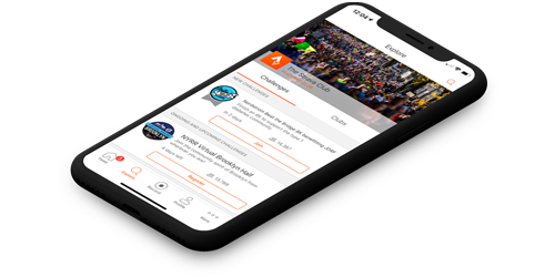
I broke the initial flow up into 5 different sections from the home screen. The app would need challenges and a recording screen to get users to do sustainable practices. It also needed an interactive aspect such as a leaderboard, profile, and feed to keep users motivated through social influence.

I identified 3 apps that have successfully used gamification to encourage users to create a habit; Strava, Love to Ride, and Duolingo. I was looking to see each app used gamification and social features for encouragement.
Strava
- The feed is intuitive to stay connected with friends.
- The challenges list provides enough information for a user to reduce an extra click.
- The profile offers a variety of stats for motivation.
Love to Ride
- The profile has badges and overall stats of all rides.
- It’s straightforward to navigate, and the icons make it fun.
- There is a full history of your activity to compare from years past.
- Recording an activity is easy. It can be linked up with Strava.
Duolingo
- The epitome of gamification. It has badges, levels, points; you name it.
- You can immediately start challenges on the opening screen.
- The profile is clean with all of the user's stats in an easily digestible way.
- The leaderboard is only accessible if you complete challenges. This is a great way to encourage users to do challenges.
Through Journey Mapping and Empathy Maps, I developed the target audience for Greener. From this, I came up with two personas.
One user is a busy Mom who wants to be more sustainable but isn’t sure how. She’s become much more aware of sustainable practices and wants to be an excellent example for her kids. While one kid is taking a nap and the other is off at school, she has some downtime to learn, but ideally, she wants to be told what to do. She uses apps like DuoLingo and Candy Crush.

The other user grew up recycling, eating vegetarian, and doing other sustainable practices regularly. As life has gotten busier, he’s started to be less strict on his sustainable behaviors. He blames it on laziness and also convenience. He’s expressed this to friends, and they have been doing the same thing. He wishes there was something to encourage him to do more. He uses Strava to track his rides and is a big Pokemon GO fan.

Information Architecture
I prepared content with a storyboard and 4-up sketches. From each sketch, I came up with four final solution sketches that shaped the digital wireframes. Greener's four screens were composed of Challenges, Recording, Profile, and a Feed/Leaderboard.
To better understand and empathize with the user I created a storyboard to visualize how the user would flow through the app. This version of the story highlights the persona like Lazy Larry.

I split the screens up into 4 sections and created 4-up sketches with a final solution sketch for each:
- Challenges
- Recording
- Profile
- Feed/Leaderboard
From the lightning demos, I found that most interpretations of a challenges screen included what level the user was on, their progress on that level, and a list of challenges. All 4 sketches had a variation of the challenges listed as either a tile with less information, similar to Duo Lingo, or a list with more comprehensive information similar to Strava. I decided to move forward with the DuoLingo-esque features.
The recording sketches began as one ever scrolling recording screen however to reduce cognitive load I broke it down into 3 screens.
Screen 1 records specific challenges selected
Screen 2 allows users to gain extra points for adding pictures or comments
Screen 3 allows users to submit their points earned, CO2 reduced, and an option to share for extra points.
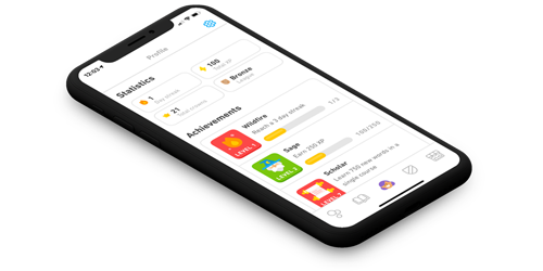
The profile screen needed to have user stats, progress bars, badges, and an activity feed. The 4-up sketches all had the same features, just different arrangements of information. DuoLingo was also a big influence on this layout.
Finally, the Feed and Leaderboard needed an aspect of social influences and competitive edge. The 4-up sketches were influenced by Instagram with the leaders displayed like Stories and the feed below. To reduce cognitive load another version had the Leaderboard and Feed as tabbed features on one screen.

The digital wireframes were created using the solution sketches and further detailed using paper prototypes. No major changes were made at this time.

Visual Design
As I developed the assets for Greener, I wanted it to feel fun, natural, and simple to reflect the aspects of the game and sustainability. The colors and typography went through a few iterations before I found the right combo
I wanted to find colors that were fun, natural, and simple. The first round of colors included a seafoam green and darker blue. After implementing the colors into the hi-fi mockups, I realized that the colors clashed.
I eventually landed on another variation of green and blue that were more complementary. This color palette also has a high contrast for those who experience color blindness.
Similar to the color palette, I wanted a simple font type that was also web-safe. I first chose Ariel but changed it to Proxima Soft. Proxima Soft was more playful and fit well with the images and icons in the app.
While deciding on the font size and weight, I also used the apple accessibility guidelines.
Sky Blue
#86BBD8
Sun Orange
#E0A458
Midnight Blue
#40476D
Grass Green
#79B473
Header 1 is 40 px Proxima Soft Condensed
Header 2 is 30 px Proxima Soft
Header 3 is 20 px Proxima Soft
Body is 16px Proxima Soft
Caption is 14px Proxima Soft
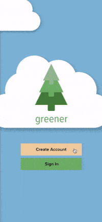
I wanted the name to be related to gaming as well as sustainability. I explored words associated with “Eco” or “Virid” but found both are widely used for environmental-based companies.
I also came across Greenie, which is defined as someone who campaigns to protect the environment. I felt this could have a negative connotation with some users. The term Greenie did remind me of conversations I’ve had in the past where people expressed wanting to be “More Green” or “Greener”. After a quick app store and domain search, I discovered it was unique, so it seemed like a perfect fit.
With inspiration from the name, I designed the logo as a green tree made of three arrows pointing. The arrows could also signify leveling up.

Prototyping & Testing
With the style guide complete, I added color and type to the wireframes. Gamifying sustainability is a unique concept and required a couple of rounds of usability and preference testing to make sure it was intuitive for all users. Greener is currently on its 4th iteration.

V1. The color palette clashed and there wasn’t a dominant color for clickable items. Some of the alignment and drop shadows also needed to be adjusted for better flow.
V2. I changed the challenges layout to list form intead of tiles, to provide users with more information. The recording screens first iteration included drop down menus, but I added segmented controls to prevent scrolling and it provided a cool visual. Finally due to confusion of where to start once users were in the app I added a onboarding carousel so users knew what to do once in the app.
V3. After the usability test and some preference testing I updated the onboarding flow and some of the icons.
V4. After V3 I decided to put Greener through the visual design ringer. I updated the color palette with more pastels changed the typography to Proxima Soft for a more playful look. I also separated the feed and leaderboard to remove any confusion still associated with the original layout.
After V2 iterations I tested the usability with 3 participants. Similar to the screens I broke the tasks up into 4 parts. I wanted to see:
- If it was intuitive for a user to pick a challenge
- What steps the users took to Record
- How users interact with the Profile
- How users interact and navigate the Feederboard
After testing, the users averaged an 84% success rate.
There were three things that stood out:
1 user skipped the onboarding walk through and wasn't sure where to start once in the game.
1 user didn't notice the segmented tabs on the recording screen, and another clicked around before finding the tabs.
1 user didn't notice the Leaders tab on the feederboard
After testing I created two preference tests. The first was for the onboarding walk through screens and the second was a more tabbed version of the recording screen.
Since one user skipped the onboarding walk through and also had trouble starting I created an overlay tutorial as an alternative. All users liked the overlay better with one user commenting:
“I’m more prone to skip tutorials like A.”
In the overlay tutorial I also highlighted the tabs on the Feederboard screen to assist any other users who might not notice the tabs.

During testing, one user suggested a clearer connection between the information on the tabs and the tabs themselves. For the second preference test I updated the connection of the tabs. All users found B to be much clearer.

Through many iterations, greener provides a way for users to learn about sustainability in a fun and engaging way. Users can develop sustainable habits through a cue and reward from each challenge using features such as leaderboards, badges, and social influence. Moving forward I'd like to do more preference testing and explore easier ways for users to record to see what users find more engaging.
Conclusion
Growth and Outcomes
Greener has been an idea since 2015, so it’s been really cool to see this app come to life. It was a fun and interesting exercise to build the app as a sprint.
As my first sprint I learned a lot through each step. I enjoyed the fast pace of getting ideas out however I would find myself getting stuck in the weeds as I navigated most of this project solo.
Initial research and lightning demos helped me understand the concepts of gamification better. It’s a pretty cool learning tool.
As a solo sprinter I wish I would have gotten more feedback earlier and done more preference testing. With a bigger concept in mind I experienced scope creep which caused unnecessary work along the way. With a clearer vision of the app I’m excited to keep working and testing this concept.