
Bus Spot™
Overview
Transit officials identified that their riders need a better scheduling tool as bus lines expand to single bus stops. Through the design process, I developed an app called the Bus Spot, a scheduling app that allows users to visually locate their bus and set arrival/departure alerts to prevent riders from running to the wrong bus.
The Problem
The problem here is twofold for the riders and the transit agency.
1. As more bus routes are being added to stops, riders are having a harder time locating their bus resulting in rushing to the bus stop for the wrong bus. Riders want a better way to locate their bus.
2. The city has recently developed a way to know how far each bus is from a stop. However, they haven’t found a way to share that information with their riders.
Users & Audience
This app is for users who have experienced an increase in the number of bus lines to their bus stops and have found it difficult to know when their bus is coming.
Roles
I was the User Experience Designer. I conducted user research, created the personas, user flows, wireframes, prototypes and final user testing. I also collaborated with my mentor Becky for assistance along the way. She provided me with feedback from the Discover to the Deliver phases.
Scope & Constraints
We will use the Transit Agency’s bus tracking data to create a working prototype of a bus tracking and scheduling app.
The bus stop at Washington & State has been having the most complaints from riders. We will only focus on that stop. We will also only focus on improving the scheduling part of the app as the trip planning functionality is working efficiently for most users.
The Solution
I have developed the Bus Spot, a scheduling app that allows users to track their bus with a live bus locator and an option to set arrival/departure alerts.
User research showed that these features were highly desirable and could help solve the pain points in the current bus scheduling system.
The transit agencies data would provide the back end functionality to make the live bus locator and real time bus alerts come to life. This in turn will give riders the information they need to make sure they are catching the right bus.

Discovery & Research
Competitive Analysis
Three of the most common transit apps are Moovit, Transit App and Google Maps.
Moovit and Transit App are both specifically for trip planning and scheduling for modes of transportation other than driving alone. Google Maps is the big name in trip planning and has defined the features that are found in most trip planning and scheduling apps.
To get a better understanding where Bus Spot could shine I did a competitive analysis of these three companies.

Moovit sets itself apart with an option to look at the bus stops and bus lines coming to a single stop. This would be helpful for riders along with the real time bus times however if the times are off it’s no longer useful to the user. Moovit also lets users set an alarm to know when to get off the bus, but no alarms or alerts before they get on the bus.
Transit App also has real time scheduling as well as bus tracking. The bus tracking doesn’t update regularly and jumps to a new locations when it updates making it unreliable to know where the bus actually is. There are options to set alerts however only when the user's trip has started. It acts more like a reminder for when the user should leave their origin. Finally the buttons on the Transit app aren’t intuitive. It requires a higher cognitive load to figure out how to 'X' out of a screen or go back.
Google Maps is the big name in trip planning and what most riders use (according to the user survey). Like Moovit and Transit app it has real time bus scheduling and the interface is very familiar to most users. Since Google Maps is used for trip planning across many forms of transportation Bus scheduling isn’t the highest priority on the app. There is the ability to start an alarm without starting a trip however it’s hard to find and if the bus scheduling is off, so is the alarm.
User Survey
To get a better understanding of the riders I sent out a survey. My goal was to determine what riders need in a bus scheduling app to make sure they were catching the bus. I reached out to friends, family and previous coworkers from a Transit App company I worked for. I received a total of 43 responses, 15 specifically bus riders, all with very similar needs.
Most bus riders rode between 2 to 5+ times per week and used Google Maps as their app of choice. When asked why they might have taken another form of transportation over the bus, 53% of the riders said it was because the live bus scheduling was off and they didn’t know where their next bus was. Most also paired not knowing where their bus was with running late.
I found that 67% of riders use transit apps for scheduling, even over trip planning.
Seeing what some of the other transit apps lacked after the competitive analysis, I was curious if users might find some ideas I had useful. I suggested a live bus locator, similar to Lyft, arrival/departure alerts, and bus capacity. I also allowed users to add their own suggestions. Out of these ideas 93% of users said they would want a Live Bus Locator, while 73% said they would want bus alerts. The results made it quite clear what needed to be built in the Bus Spot.
Finally 66% of riders said they would ride more if these features were added to transit apps. This could not only be a great opportunity for the Bus Spot app but also for transit agencies to increase their ridership and ROI. In turn giving them the ability to improve their infrastructure and improve rider happiness.
Personas
After conducting the survey and getting a better idea of the users needs, I created two personas to represent the average bus rider.

One rider is a Project Manager who rides 5+ times a week, the other is a Software Engineer that rides 2-4 times per week.

Both users are frustrated with the live bus schedule being off and having to sprint to the bus stop. The software engineer would also like an alert since she doesn’t ride frequently and needs a reminder.
Define
User Stories
After gaining a better understanding of our users, I eventually broke the users needs into 4 user stories.
The biggest pain point for the user was that they wanted to have a better tool to figure out where their bus was and an alert to help them get there on time. From this I developed the following stories, 3 high priority and 1 medium priority.

User Flow
Once the user stories were set I began building the user flow. I had a lot of scope creep in this phase. With a few iterations I found a way to eliminate the creep and still be able to fulfill my user stories that were just focused on scheduling.
In a much more succinct flow the user can see bus details or set an alert for their bus directly from their home screen. The alerts appear as a pop up window letting the user know if their bus is arriving soon or leaving the bus stop. This feature will need to be configured from the back end with the Transit Agency’s data.
Wireframe Sketches
With the flow in motion I began sketching the first iteration of the Bus Spot.
My first wireframe sketches had a lot of similarities to the Moovit and Transit app. The concept also wasn’t just for scheduling, it was for trip planning too.
On the opening screen the user could find their destination and tab to a live map and bus stops. The bus stops screen allowed users to find more bus stops near them as well as the bus schedule.
These first sketches had the normal trip planning walk through:
- Choose your destination
- Add favorites
- Choose the best route
- Trip overview
As part of the scheduling the user could find more information from a link in the trip details where they could see other bus times and turn on arrival and departure alerts. These initial sketches were all very complicated and had a lot of scope creep.
I unfortunately didn't realize the amount of scope creep in my initial layout so I developed these screens digitally with more details and used them for my first usability test.

Digital Wireframes
The digital wireframes were created using the solution sketches and further detailed using paper prototypes. No major changes were made at this time.
Usability Test Round 1
The first round of usability testing was very helpful. Watching users interact with the wireframes helped me see that I designed much more than what the transit agency was asking for. The same information could be found in multiple places and a lot of it wasn’t necessary for the scope of the project.
The tasks were created for scheduling through trip planning. The users needed to find their bus schedule, find the bus route with the quickest time (out of scope), set an alert for busses arriving and leaving the bus stop, and start your trip (out of scope).
All of the users described the opening screen very thoroughly. However when it came to finding the bus stop details a few of the users clicked around before clicking on “Bus Stops” in the nav bar. I wasn’t sure if this was due to everything being black and white or if it was poor instruction on my part. Some of the labels were way too small and didn’t have any indicating colors making it difficult for users to complete the tasks. All of the participants completed all of the tasks eventually.
Next steps for improving the app resulted in removing the trip planning screens, making the labels larger and renaming some of the headers. Through those changes I also realized I never created a pop up for the bus arrival and departure alert.

Visual Design
Branding
To develop the brand I put Moovit, Transit App and Google Maps through the design competitive analysis ringer. All of the apps use primary colors with a splash of a secondary color, usually orange or green. The layout of the apps were all very similar to Google Maps with the exception of the Transit App. Transit Apps exit buttons were not in the usual spot and therefore increased the cognitive load for users.
After digging into what the competition has done and looking at the goals of our app I decided I want the brand to have characteristics of conviviality, reliability and trustworthiness.
Convival — Like the bus, The Bus Spot provides a friendly, enjoyable experience for their riders.
Reliable — Riders can rely on The Bus Spot to know where their bus is.
Trustworthy — The Bus Spot can be trusted to have accurate information to get riders to their destination.
Color Palette
Like the competitors I also wanted to stick with the primary colors with an accent of green. These colors give the app a familiar and friendly feel.
Typography
For Typography I chose Proxima Nova. It is a web safe font so it will be guaranteed to be available for all users across many devices. The single font also keeps everything simple and consistent.
Header Blue
#294DF2
Bus Green
#71BF39
Warning Yellow
#F2C029
Error Red
#D94A3D
Header 1 is 35px Proxima Nova
Header 2 is 24px Proxima Nova
Header 3 is 18px Proxima Nova
Body is 14px Proxima Nova
Caption is 12px Proxima Nova
Logo Design and Process
The Bus Spot was brainstormed around a list of synonyms related to transit, alert, schedule and locate. I ended on three names that I felt were appropriate for this app and weren’t available in the app store. Those three were Buspy, Where’s the Bus App and Bus Spot.
Busby was a combination of Bus and Espy, meaning catch sight of. The logo would have been a bus viewed through binoculars or a spyglass. With the correct pronunciation of Espy it would have sounded more like “Best Buy”. Not the best option when trying to differentiate a new brand.
The next option was Where’s the bus App, a funny play on words for “Where’s the bus at?”. The logo would have been a bus with its side mirrors looking like a shrug. In the end I think it was a little too silly and there was a bus game already on the app store called Where’s the Bus.


High-Fi Mockup Iterations
I split the High-Fi mockups into three different sections to make sure the flow of each was being accomplished; onboarding, turning on the alarm and finding the bus schedule.
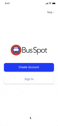
I added an onboarding flow that started with the option to create an account or sign up. After the user creates an account they are brought to a carousel of app tips before getting to the home screen. The onboarding instructions were added to help users understand what features the app had, specifically the bus alert toggle. I used color to show whether the bus is running on time, a similar feature to what Google Maps has.
On the home screen, I changed the verbiage to “Arrival and Departure Alerts” to make it more clear what the toggles were for. I updated the icons and added the brand colors as well as the new logo. I grayed out bus 10’s information since the gray busses are supposed to indicate a bus that’s out of service. I also made the circles on the busses bigger so the numbers were more legible.
The bus information on the bus stops screen was redundant to the home screen so I changed the leave times layout to make it clearer what the numbers were for and also added arrows to show that there was additional information available.
On the bus details screen, I updated the header to make it clear what bus the schedule was for. I also changed the schedule screen to show details for each individual bus unlike before where it had multiple bus schedules on one. This simplified the screen and made the information much easier to understand.

Prototyping & Testing
Usability Test
For the final round of testing, I wanted to see:
- If the users found the onboarding information helpful
- If they understood the toggle alert or found it useful
- If they could find the bus schedule for their bus.
The results were interesting and led to a very clear understanding of where fixes needed to be done.
I asked the users to walk me through:
- The onboarding process
- How they might use the app to make sure they don’t miss their bus
- How to find the bus schedule to get more info about their bus.
I tested 4 users
All four users got through the onboarding and toggled on the alert with ease.
Finding the schedule proved to be difficult for 3 of the 4 participants.
After testing, the users averaged an 84% success rate.
My biggest takeaways were that:
I realized that the location of the bus stops on the nav bar was not intuitive to find the bus schedule. I probably should have taken note of this more after the first usability test, but the second round really confirmed it.
It was also very clear that users wanted to click on the bus information on the home screen to find more information. One user said:
“This is where I would have accessed more bus information on other apps.”
Through this I realized that the bus stops nav was unnecessary for this project. It was out of scope for the project since we were just focusing on one bus stop, and it didn’t help the user. The users found the toggle alarm helpful and understood what it was for.
After usability testing, I removed the nav bar at the bottom and added a settings button on the map screen. If the transit agency wanted to provide their riders with more information about other bus stops later on, an icon could be added above the setting icon for the bus stops screen.
The bus schedule is now directly accessible from the home screen. I added the leave times that were previously on the bus stops screen along with an arrow to show there is more information available.
Finally I changed the toggle to be on the right of the screen, separate from the bus number. Just in case any bus numbers happen to be longer than 3 digits. On the bus schedules screen I updated the language to make it clear that it was the full bus schedule for that particular bus.

Final Prototype
Through a very iterative process the bus spot provides a solution for the riders and the transit agency.
The live bus tracking and the bus arrival/departure alerts provides riders with more information to get to their bus stop on time. No more guessing if the next bus is theirs or when the next bus might be arriving. The alerts can also give riders more time if they already know they missed their bus and lets them quickly make a decision if they should wait for the next bus or not.
In addition to the riders the transit agency now has a vehicle (pun intended) to get bus tracking information to their users. With this information it will provide some really cool backend features for live bus tracking and accurate pop up alerts with updated bus info from the database. In the end if this app does increase ridership as the survey suggested, transit agencies could increase their ROI.
Conclusion
Growth and Outcomes
After many iterations and many hours later the Bus Spot was born.
Through this I learned that project creep is easy to get lost in. After the first usability test it became very clear the app needed to be scaled back quite a bit. Fortunately that was a quick adjustment and the scope became much clearer.
After making and adjusting the high-fi mockups and developing the visual design it also made it easier to see what worked and what didn’t. The last usability test really helped tie everything together.
I removed the lingering scope creep of the bus stops screens and changed the features to get the users to the schedule with the fewest amount of clicks.